I agree, the title for this post needs reworking, but it’s the newest game Sammy picked up at preschool and he has been walking around saying “Duck, Duck, Goose”. In any case, this waterfowl pitcher is a different form I am experimenting with. It has a more elongated base and a wider mouth. The effect, to me, is a bird on the water. The combination of form, texture and glaze recalls the style from a couple of decades earlier. Don’t you think?
Waterfowl Hand-built ceramic slab with handcarved surface detail. Commercial glazes of contrasting colors on the inside and outside, iron oxide wash, fired to Cone 6.
The idea for this little guy came from the beautiful midnight blue family of jays that lived in the tree next door all summer long. I miss them. The photo does not do enough justice to the actual glaze, which is a deep, dusky charcoal with undercurrents of blue.
Mr. Jay Hand-built slab with hand carved textured details. Commercial glaze fired to Cone 6.Mr. Jay (Top)
Off to the season’s best parties Hand-built slab pitcher with carved details. Commercial glaze, iron oxide wash, fired to Cone 6.
Like birdsong in winter, I’ve been too busy sheltering from the cold to throttle about much, but oh, I’ve been busy in the studio making pitchers, and ceramic jewelry (a post on that coming later this week – I have a case made for a Wearble Art show at the Orcas Center, opening this Sat, Dec 1). My newest bird friends will attest to that. Enjoy the next couple of posts. These birds are all very versatile 5-inch tall pitchers that fit snugly in the hand for pouring. Use for milk, olive and nut oils, dressings on your table, or for bath salts, soap or shampoo holders. Food safe glazes and textured wings provide a firm grip.
Heading out of the Eastsound Post Office early this week, on Monday, I glanced up at the sky and the first autumn colours caught my eye. Two trees, leaves in copper red, framed the roofline of the café across the street. Already? My summer guests just left!
In my studio, drying on a paper towel, were eight ceramic pieces that I had hand pinched to recall fallen leaves and twigs. They were bisque fired, treated with an iron oxide wash and just given a light coat of satin polyurethane to protect the surface etchings. These were made last summer, entirely on a whim from leftover clay coil scraps that I did not want to toss out (isn’t that how it always begins?). I had no fixed idea of what I intended to do with them, but I had taken them out a week ago and believed that if I kept them in plain taunting sight, I would be compelled to use them for something.
Well, this is what I did on Wednesday with some copper wire and a collection of delicate jadeite beads purchased when I lived in Beijing over a decade ago. I was trying to create the image of nature’s cycle – of an old leaf or twig wrapped in a copper ‘tendril’ that was wet with delicate beads of morning dew.
I showed them to my mother-in-law who quipped, ‘Ah, just in time for fall.’ Wait, it didn’t occur to me in the studio, but perhaps those copper leaves I saw on Monday were the inspiration behind these pendants/mixed media miniature sculptures. Duh!
When I design something, I do think about how it can be used, but this little piece surprised me. Can you tell what this pendant was originally designed for?
Anvil Blue on waxed cords
Not so successful in its original purpose, I strung it on three waxed cords on a whim, the night before a sale, and sold four of these the next day. Something about the shape, the way it sits on the neckline or where it leads the eye, flatters the wearer. Dare I say sexy? Someone said it had a retro reference, well, an added bonus. It looked good with the bare shoulder styles in tropical Singapore. I left it at that.
Anvil Blue on Wool
On Orcas, where the pacific Northwest summer breeze is more unpredictable, I strung the last pendant in this style on a necklace that I had made using curly knitting wool that I had woven like a ‘friendship band’ in some sections, and it changed the look of the pendant immediately. It can be worn lower on the front, over turtlenecks and sweaters, almost like a long, loose scarf, warm and fuzzy around the neck. Neat. Now I have a versatile accessory that adapts to the seasons. It would be fun to wrap around the waist as a belt buckle too. To think it started life as a napkin ring.
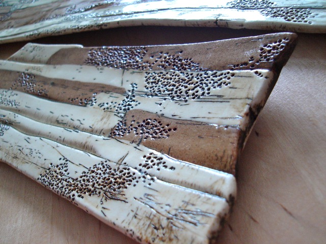
A dish for sushi anyone? Oysters? Chocolate? Chocolate truffles. This set of three started off as an idea for one large, long platter, made by laying and pressing together flattened coils of toasted clay with flattened coils of white. I wanted to test the need to blend the two clays.
Driftwood on Eastsound beach
The surface texture was meant to conjour up an image of sun-bleached driftwood washed asore and stacked high on the sand bank. The holes add a textural element suggesting porousity and inherent decay, or as if it were being eaten from the inside by some insect. By serendipity, someone knocked the shelf where it sat after bisque firing – and there must have been a fault line because of the minimal blending – but it fell into three separate parts of one long dish and two smaller ones. I sanded it out, applied oxide over the surface, burnished it off and glazed it one colour. Fired. Voila!
Porcelain Rattle Bottle in Blue and White by Ellen Wherrette
I write this, totally bemused. I’ve made my (unexpected) first sale here in the US. Yay! I was on Day Two of the annual Orcas Island Artists Studio Tour, visiting the studio of ceramic artist and sculptor, Ellen Wherrette, when she bought one of my own floating ceramic necklaces right off my neck – literally. She liked it so much that she put it on immediately. Truth be told, it looked better on her than it did me. Thanks, Ellen, for a wonderful morale boost – I am honoured!
I made it months ago in Singaporean ceramic artist Jessie Lim’s studio. It features a fired, hand carved tribal mask pendant in an oxide wash, strung together with similarly treated hand coiled ‘bone’ fragment beads. The oxide was brushed on, left to dry and then burnished off with newspaper to get the aged effect. I used a clear nylon string so the beads would float on the wearer’s neck.
Here is a much chunkier version of the piece that Ellen now owns, to give you an idea.
Currently one of my favourite pendants. I did a series of these in different colours and with different carvings and textures. I like the negative space cut out in the middle because it lightens the piece. I also softened the back rim of the pendent with a small carving tool and sponge to give it a more refined aesthetic. What I see are more possibilities for this design, such as adding a floating bead in the negative space or linking to a couple of smaller ones for a chunky choker.
The idea was to create a set of vases to set off large fronds of palms, no flowers required. This is a test set of flattened coil vessels inspired by the trunks of the palm trees you see everywhere in Singapore. The rings in the trunks are repetitive in such a modern way, and yet so tactile; I always want to reach out and feel its roughness on my palm (no pun intended). The two on the left are made with white and toasted clay and a single colour glaze – the two toned effect is the result of the glaze on two types of clay.
The vessel on the right features a long oval base that demanded a little more hand control to maintain the shape as I built up, but the result was that the body fits snugly in my hand when I held it, giving it a lot of potential as a drink holder of some sort.
One day, I was sitting in my kitchen and I realised that I did not appreciate the blatant advertising on the cereal boxes, oil bottles, tin cans and other packages on my open shelves. I am working on a grand plan to eliminate unsolicited advertising in my home. This bird pitcher is an original design and a step in that direction. It is a cheerful piece that is functional as well. It holds and pours oils, liquid soaps and perhaps sake. Let your imagination take flight!


